Visual Guidelines
A comprehensive guide to keeping the P.A.W.S. Nutrition visual identity consistent and recognizable across all platforms and materials.
Effortless Canine Wellness
P.A.W.S. Nutrition is a premium pet supplement brand setting a new standard for clean, effortless canine wellness that fits into everyday routines. Our visual identity reflects warmth, trust, and a deep love for pets.
Naming Convention
To maintain the integrity of our identity, the brand name must always be written with dots between each letter.
Love for Pets
Every product is designed with the well-being and happiness of pets in mind.
Human- Grade Ingredients
Clean nutrition dogs instinctively crave and love
Backed by Science. Powered by Nature
Never a generic all‑in‑one. Tailored to address specific needs.
Made in the USA
Made in state of the art GMP Certified production facilities.
Our Voice
P.A.W.S. Nutrition' communication is simple, playful and straight forward. We speak without being overly complicated. No fluff. No buzzwords.
P.A.W.S. Nutrition
@pawsnutrition
Our Logo
The PAWS logo is our most valuable visual asset. An immediate expression of our bond with dogs and our commitment to quality, brought to life through modern, effortless design.
Clear Space & Secure Area
- Define X: The protected zone is exactly the height of the ‘P’ in ‘PAWS’.
- Automation: Assets ship with this margin built-in (48 px baseline). Align the asset corner to the canvas corner for instant protection.
- Protection: Keep this zone free of text, graphics, or competing visual weight to allow the brand to command attention.
The Intelligent Asset
Smart Corner Alignment
By baking the margin into the file, we eliminate manual measuring. Simply align the asset corner to your canvas corner, and brand protection is instantly applied.
The Cream Variant
The Cream logo variant is reserved for highly specific visual environments where the surrounding content is predominantly cream-based. This ensures the brand mark integrates seamlessly into a warm palette without sacrificing legibility.
.png)
.svg)
.png)
.svg)
.png)
.svg)
.png)
Usage Best Practices
Always
- ·Use only official corporate color variants
- ·Maintain original proportions when scaling
- ·Respect the automated Secure Area padding
- ·Prioritize high-contrast background placements
Never
- ·Stretch, squash, or distort the logo geometry
- ·Apply drop shadows, glows, or bevel effects
- ·Alter the typography or symbol relationship
- ·Rotate or tilt the logo on any axis
Logo Placement & Size Guide for Social Media
To maintain consistent visual prominence across different aspect ratios, logo dimensions are mathematically scaled based on the 1080px shortest-edge rule. This ensures the brand mark carries the same relative weight whether on a square post or a tall vertical canvas.
Canvas
1080 × 1350
Logo W × H
200 × 85
X Zone
48 px
Total Size
248 × 133
Canvas
1080 × 1440
Logo W × H
213 × 91
X Zone
51 px
Total Size
264 × 142
Canvas
1080 × 1080
Logo W × H
160 × 68
X Zone
38 px
Total Size
198 × 106
Canvas
1080 × 566
Logo W × H
84 × 36
X Zone
20 px
Total Size
104 × 56
Canvas
1080 × 1920
Logo W × H
284 × 121
X Zone
68 px
Total Size
352 × 189
| Format | Canvas (px) | Ratio | Logo W × H | X — Secure Area | Total Asset Size |
|---|---|---|---|---|---|
| Vertical Anchor | 1080 × 1350 | 4:5 | 200 × 85 | 48 px | 248 × 133 |
| Tall Carousel | 1080 × 1440 | 3:4 | 213 × 91 | 51 px | 264 × 142 |
| Square | 1080 × 1080 | 1:1 | 160 × 68 | 38 px | 198 × 106 |
| Horizontal | 1080 × 566 | 1.91:1 | 84 × 36 | 20 px | 104 × 56 |
| Stories / Reels | 1080 × 1920 | 9:16 | 284 × 121 | 68 px | 352 × 189 |
Flexible Placement
While bottom-left is our standard, the logo may be anchored in the upper-right corner when design hierarchy permits. The same mathematical logic applies: aligning the Intelligent Asset to the corner instantly secures the proportional area for that specific format.
Bottom-Left Anchor
Upper-Right Anchor
Lockup Philosophy
The PAWS brand mark and tagline never overlap. Following our 1080px shortest-edge rule, the distance between elements is calculated to maintain visual tension and authority across any social media format.
Spatial Hierarchy
To prevent visual suffocation, the tagline ("Sprinkle the Good Stuff™") must never overlap the primary logo. Maintain a distance that allows both elements to command attention.
Trademark Precision
The trademark symbol (™) must always be formatted as superscript and set at exactly 50% of the tagline's text size.
Trademark Hierarchy & Balance
By maintaining a clear separation between the logo and tagline, we ensure that neither element loses its visual impact, creating a professional and premium narrative flow.
Trademark Formatting Guide
Visual Example
Sprinkle the Good Stuff™
CSS Implementation
.tagline {
  font-size: 24px;
}

.tagline sup {
  font-size: 50%; /* 12px */
  vertical-align: super;
}
Always use relative sizing (50%) rather than fixed pixel values to maintain proportional scaling across different sizes.
Brand Colors
Our color palette is carefully selected to convey warmth and trust.
Each color has a specific purpose in our visual communication.
Primary Colors
PAWS Navy
#1D2160Core brand color used across logo and identity.
Off White
#F7F7F5Essential for contrast and clean typography.
PAWS Cream
#F9F3E5Main background and breathing spaces.
Neutral / Background Colors
Sky Blue
#B2C7FCSoft Peach
#F79E7AMint Fresh
#91FCECUse light tones to create a clean, minimal, and premium look.
Neutral background colors are for specific cases of using product color coding, mainly for backgrounds.
Product Color Coding
Joint
#1D2160Color-coded for Joint support products.
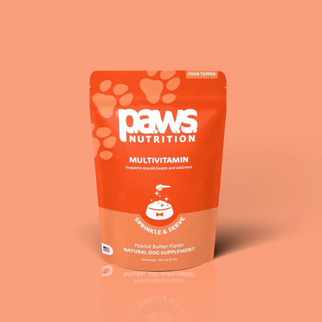
Multivitamin
#ED4F1FColor-coded for Multivitamin products.
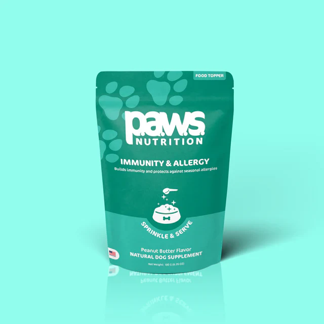
Immunity
#3DB2A1Color-coded for Immunity support products.
Each product is color-coded for easy recognition and differentiation.
Brand Color Wheel
Colors positioned at their real hue angle. Inner ring = primary identity · Outer ring = product color coding · Satellites = neutral backgrounds.
For product content: Hip & Joint, Immunity & Allergy, Multivitamin.
Drag to rotate
Immunity
#3DB2A1
Product — Immunity
PAWS Navy
Multivitamin
Immunity
Suggested palette — Immunity
Universal Typography Color
PAWS Black
#12142E
Typography / TextUI & Informational Utilities
Tag Background
#F3F4F6
UI Utility | Fondo sobre blanco o cream en items informáticosTag Text / Labels
#A5A6BF
UI Utility | Textos secundarios y etiquetasAccessibility
As a brand backed by science, our designs must comply with strict legibility standards. Body copy must always remain Navy Blue or White.
Typography System
Science-backed nutrition
Edit Content
Type below to see how Public Sans and Aptos work together in a real layout.
* Controls spacing between text categories, not internal paragraph line-height.
Scale Ratio: Major Third
Each level is 25% larger than the previous one.
Design Tool Application
In Figma, Illustrator, or Canva, multiply your base size by 1.25 for each level of hierarchy.
Science-backed nutrition
Premium nutrition for happy, healthy pets.
Every pet deserves to live at their healthiest; every wag, every walk, every day. That belief is rooted in real science that’s made simple to love.
Brand Font Assets
Aptos Brand Font
Complementary & Body Font
Public Sans
Primary Title Font
Main Titles
- Use Public Sans for H1 and H2
- Keep headlines bold and geometric
Subtitles & Body
- Use Aptos for H3, H4 and Body Text
- Minimum 14px for body readability
Grid & Vertical Rhythm
Our spacing system is based on an 8px grid, ensuring consistency and visual balance across all brand materials and digital interfaces.
Spacing Control
Spacing Rules
- 1Always use multiples of 8px for spacing between main blocks.
- 2Use 16px or 24px for internal padding in cards and components.
- 3Maintain proportional balance across all alignments.
- 4For Product UI, limit density to a 56px maximum to ensure focused interaction.
Toggle between views and move the slider to visualize the grid rhythm.
Iconography
Our custom icon set is clear, friendly, and consistent across every platform. Each icon is crafted to stay legible and impactful, even at the smallest sizes. Download in SVG or PNG formats in our core brand colors.
Categories
Icon Size
48px
Bone
dogs
Collar
dogs
Delivery
science
Express Delivery
science
Dog Sitting
dogs
Dog Standing
dogs
Dog Sitting Alt
dogs
Dog House
dogs
Leaf
science
Made in USA (Circle)
science
Made in USA (Square)
science
Paw
dogs
Quality
science
Sample Tube Handling
science
Test Tube
science
Atom
science
Call to Action (CTA) Strategy
Brand Red is a core identifier for P.A.W.S. Nutrition, but using it as the default CTA color can unintentionally signal “stop,” “error,” or “forbidden” in digital interfaces. To create a more seamless, inviting, and conversion-friendly user experience, we recommend a deliberate color hierarchy for interaction design.
Primary: Brand Orange
Orange is energetic, warm, and highly clickable. It stands out perfectly against our Cream and Dark Blue backgrounds without feeling aggressive. Best for "Add to Cart" or "Subscribe" actions.
Secondary: Dark Blue
Dark Blue conveys trust, science, and stability. Used in solid or "hollow" (outline) styles, it is perfect for secondary actions like "Learn More" or "View Details" to establish a clear visual hierarchy.
1. Primary Actions (High Emphasis)
Used for the main action on a page (e.g., checkout, primary signup). We strongly recommend using Brand Orange or Brand Green for these to drive conversion without the negative connotations of red.
Option A: Brand Orange
Option B: Brand Green
2. Secondary Actions (Medium Emphasis)
Used for alternative actions or informational links. The "Hollow" (outline) style is excellent for pairing next to a Primary CTA.
Hollow Style (Recommended)
Solid Style (Dark Backgrounds or High Contrast needs)
3. Tertiary Actions (Ghost/Text)
Used for less important actions, like "Cancel" or "Go Back". Relies on typography and hover states rather than a bounding box.
4. Semantic Actions (Red & Green)
Reserve Red and Green strictly for actions that communicate a specific semantic meaning (Danger vs. Success).
Destructive / Warning (Brand Red)
Only use red for actions that cannot be undone, or to clear data. This utilizes the psychological "stop" nature of red effectively.
Success / Confirmation (Brand Green)
Use green to confirm positive states or successful submissions. We've added a high-brightness "glow" state to emphasize complete success.
Visual Language
Beyond the logo and colors, P.A.W.S. Nutrition uses a set of visual elements that reinforce our identity and create memorable experiences.
Photography Guide
How to capture the essence of P.A.W.S. Nutrition
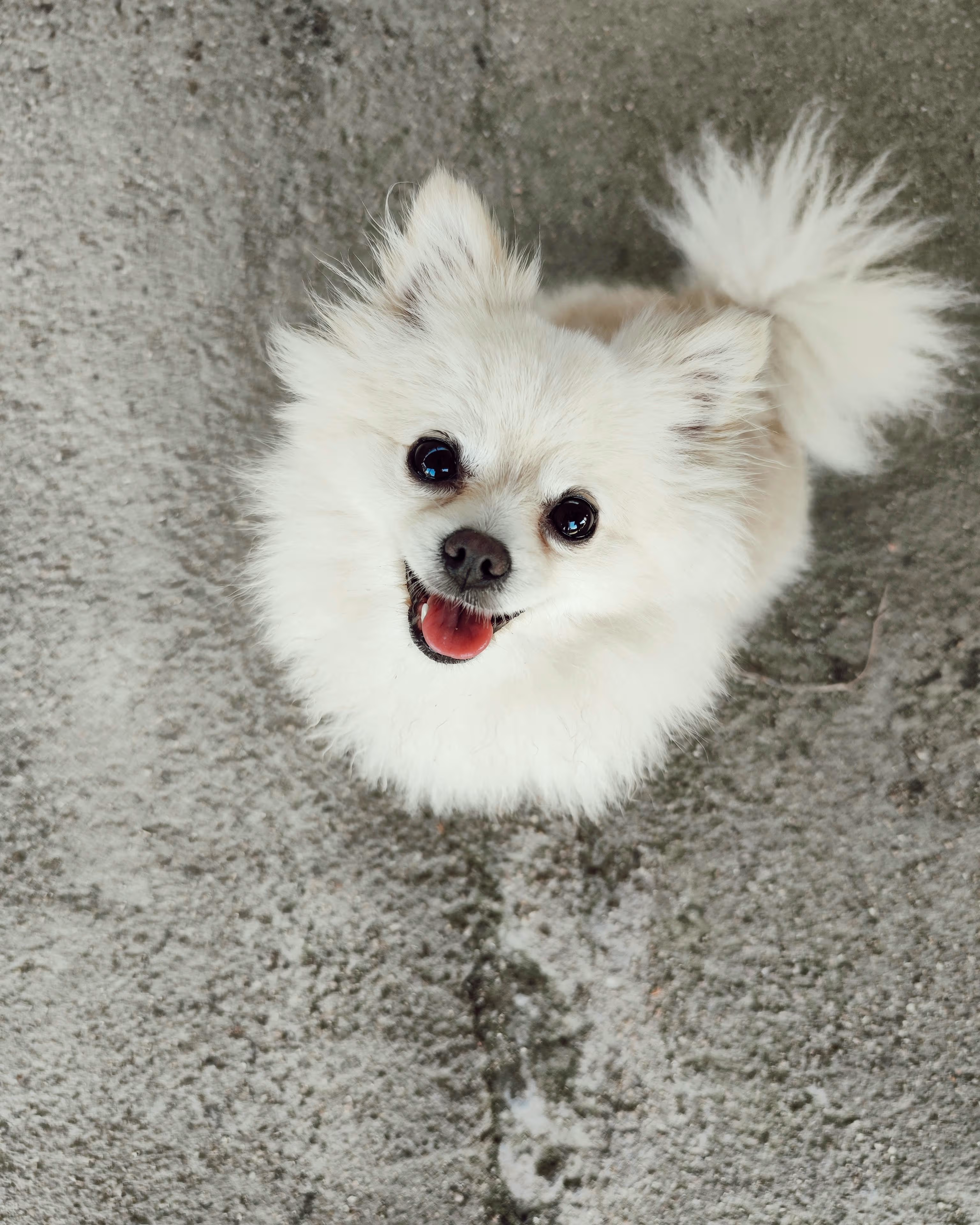
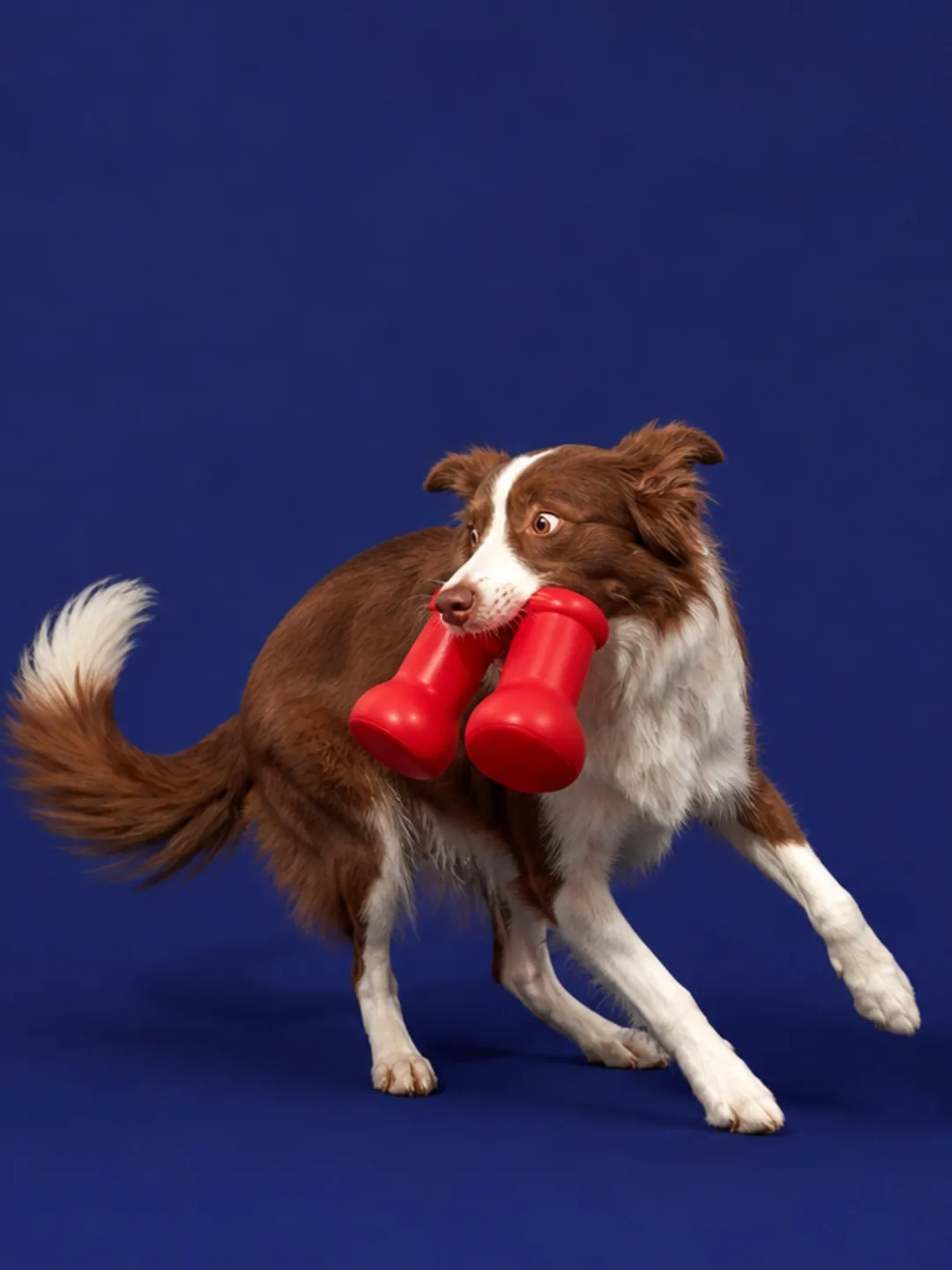
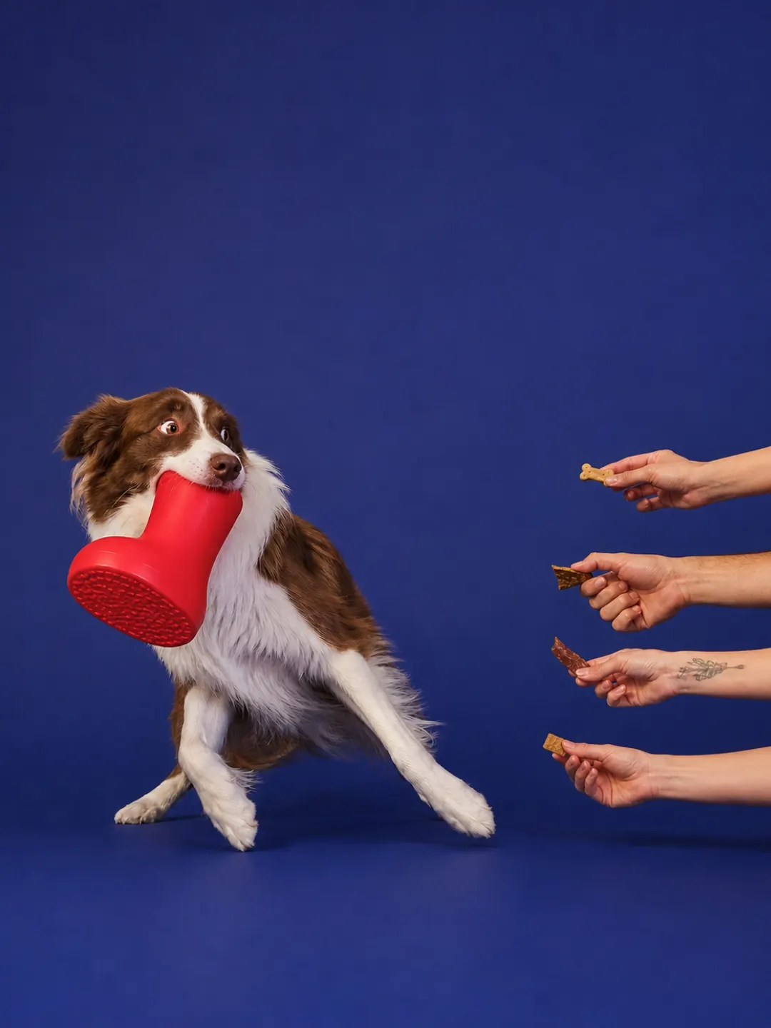
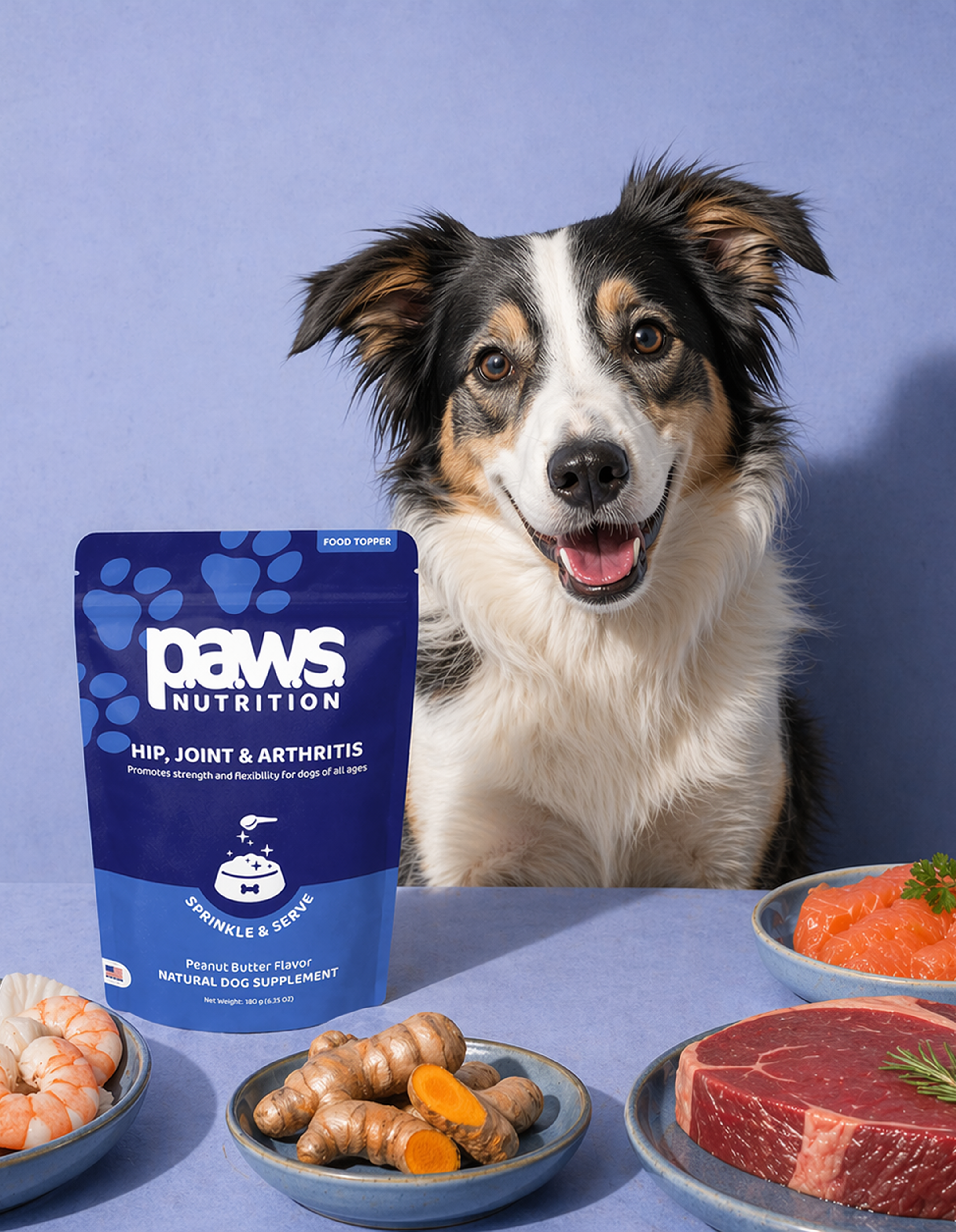
Happy Pets
Photographs of healthy, active, and happy pets in natural or home environments.
Artistic Compositing
Artistic photomontages and AI-assisted imagery are permitted, provided they maintain an ultra-realistic appearance and avoid unrealistic exaggerations.
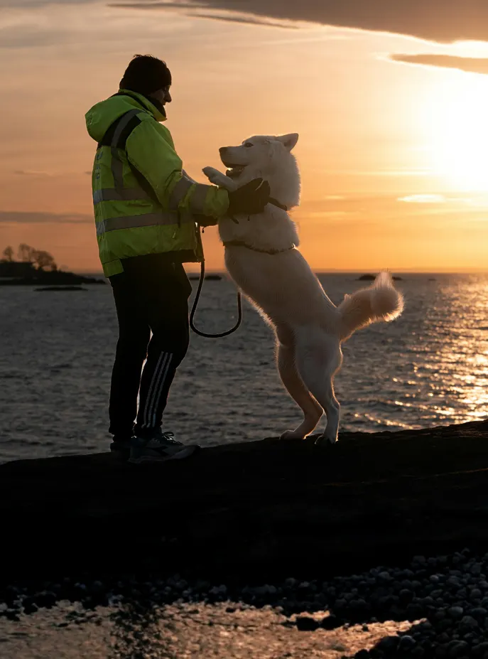
Emotional Connection
Showing the relationship between pets and their owners, moments of affection.
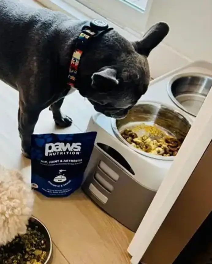
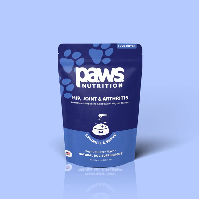
Product in Context
Products shown in real-use situations, not just in the studio.
Iconography Styles
Our visual language favors soft, rounded corners and stylized forms that convey warmth. We avoid using sharp edges, flat borders, or rigid square margins in our icons and UI elements to maintain a friendly and organic appearance.
Line
Thin stroke icons for interfaces
Solid
Filled icons for emphasis
Duo-tone
Brand color combination
Digital Interface & UI Design
Our digital products are designed to be intuitive and clean, ensuring the PAWS identity feels cohesive and recognizable across every pixel of the user experience.
Main Website
Landing page and product pages
Mobile App
Nutritional tracking application
Email Marketing
Email templates
Web Interface Example
.svg)
Need more resources or have questions about brand applications?